MY ROLE
CLIENT
SUMMARY
MY ROLE
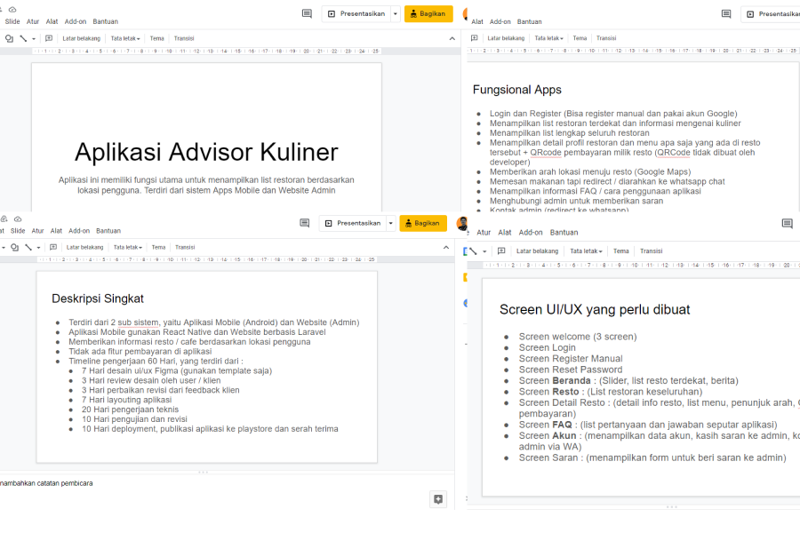
At the beginning, as usual, I got a document about this project from my project manager at Sanbersy Company, I was given things related to the project timeline, client name, application functions and how many screens to create
After I got the requirment, of course I didn't immediately jump into figma to design the interface, before that I had another discussion about the requirements given to me, such as confirming the timeline, application functions, application objectives etc.
insight: after conducting a meeting with the project manager I get insight from the meeting such as the application function only displays a list of nearby restaurants, the payment method by displaying the store barcode and the order will be thrown via WhatsApp API Businees
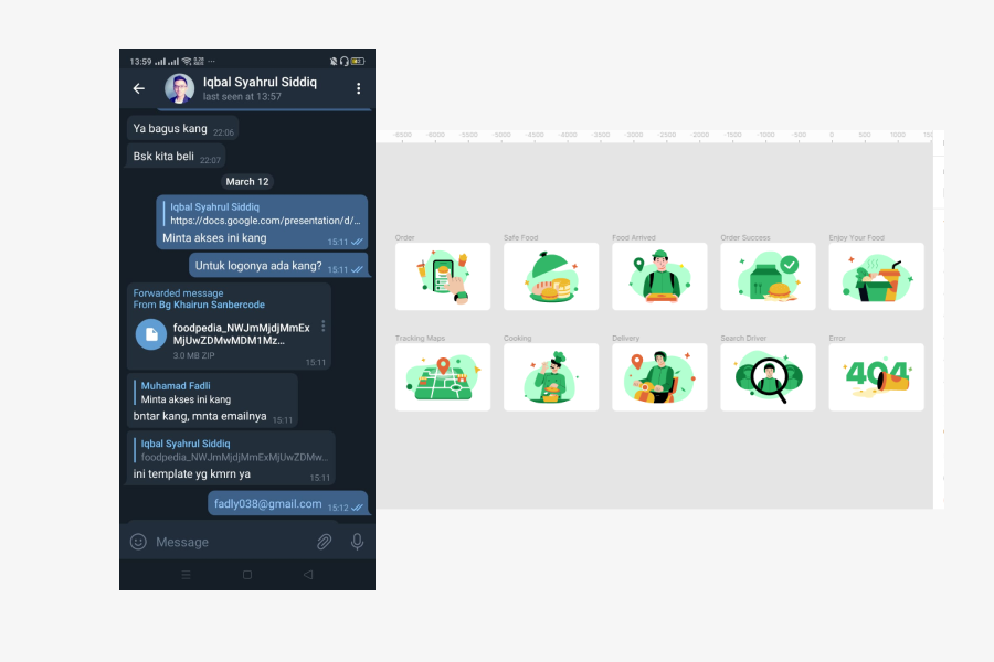
After conducting a meeting and getting insight from the project I immediately designed the interface of this application and before that I asked to buy an asset project for illustration because this is a project that requires a short time so I decided to illustrate buying assets on an asset selling site
because the project only makes the interface of this application, so I immediately looked for design inspiration to determine the layout of the application that I designed
insight: Insight: tell me how the layout I will design is fast and functional and easy for programmers to implement
After creating a moodboar for inspiration from the layout I made, then I created a style guide, from colors to typography
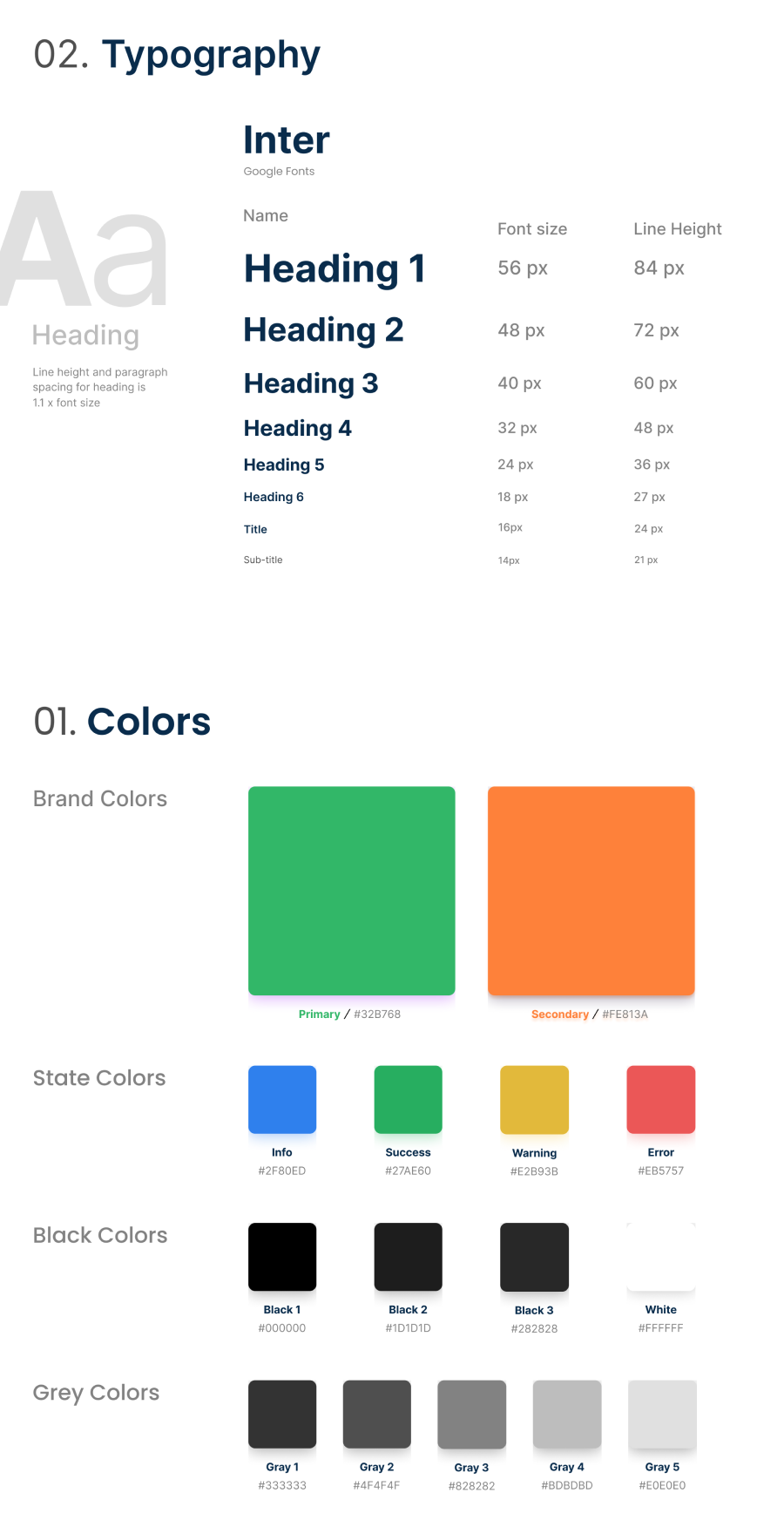
insight: By making this style guide it makes it easier for me to adjust the colors and typography in the designs that I make later and will certainly speed up my design of the interface in the future
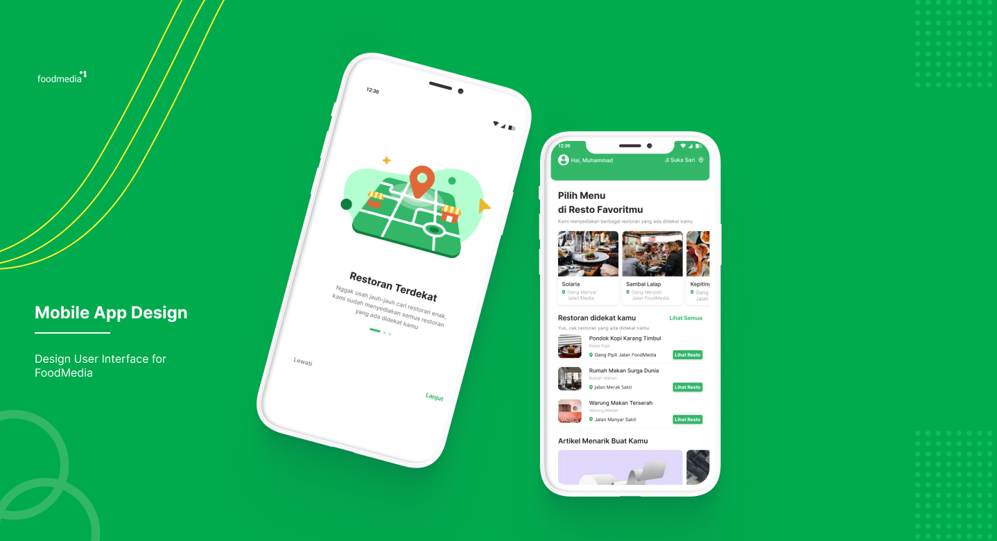
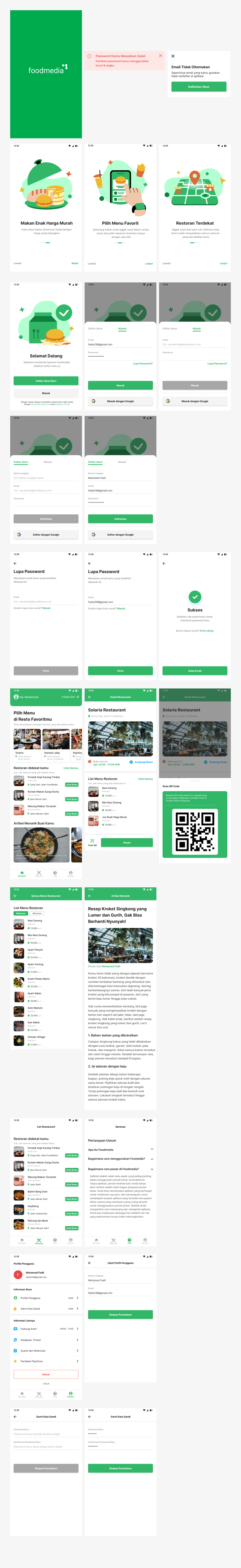
Then I immediately designed the splash screen and register screen at Figma
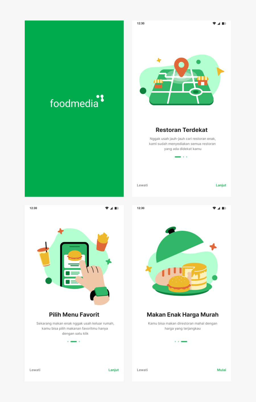
the green color is taken from the brand color and 3 onboarding describes the function of the application
Furthermore, the welcome screen design to the pop up alert
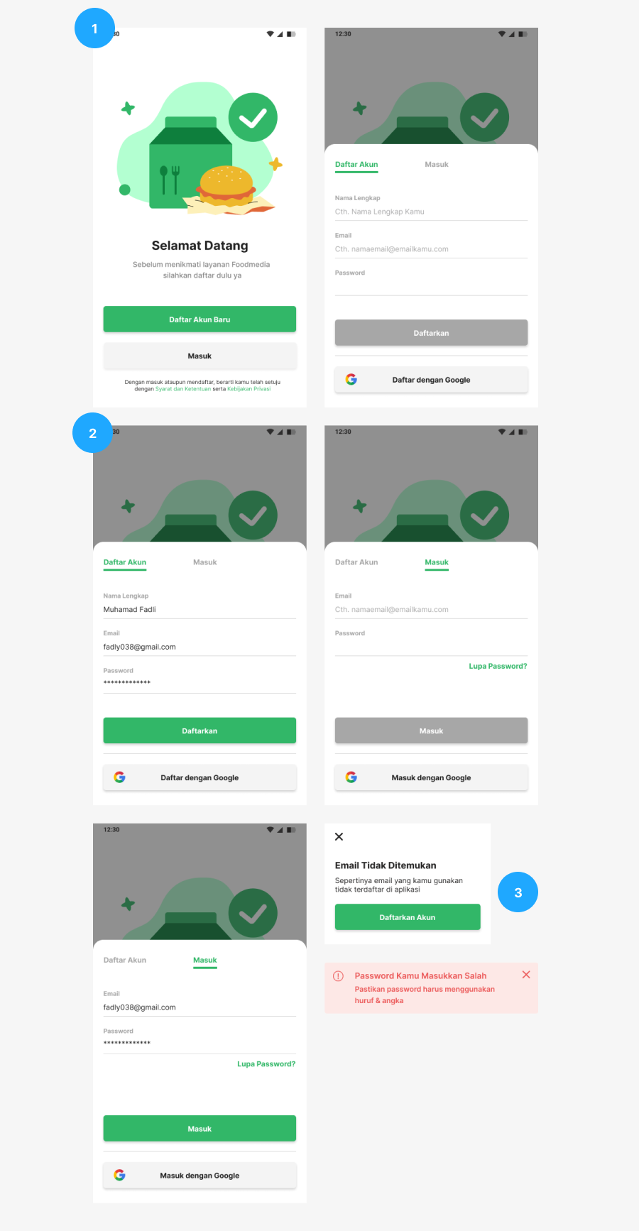
1. Before entering the user must register or log in to this application
2. Register and login with a pop up screen
3. The pop up email has not been registered and the forget password alert provides information in accordance with the usability heuristic principle, namely error prevention
Then I designed the forgot password screen
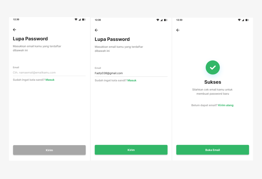
in accordance with the usability heuristic principle, namely user control and freedom, which makes it easy for users if they forget their password and can immediately change it via the application
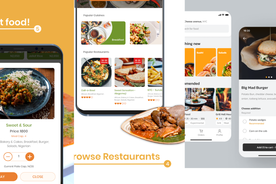
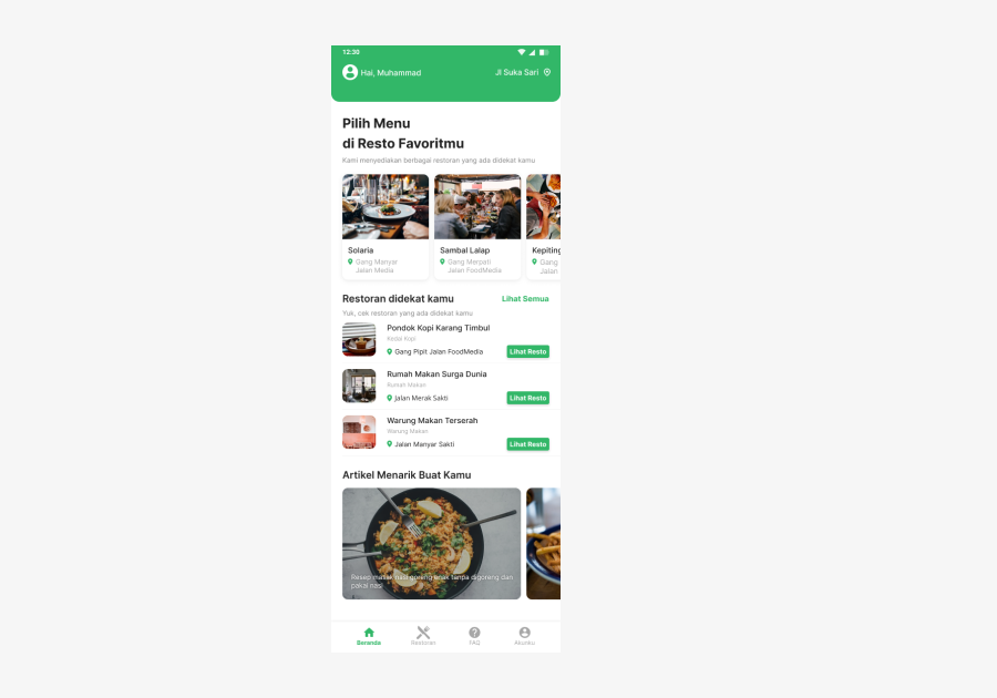
Then I designed several main screens
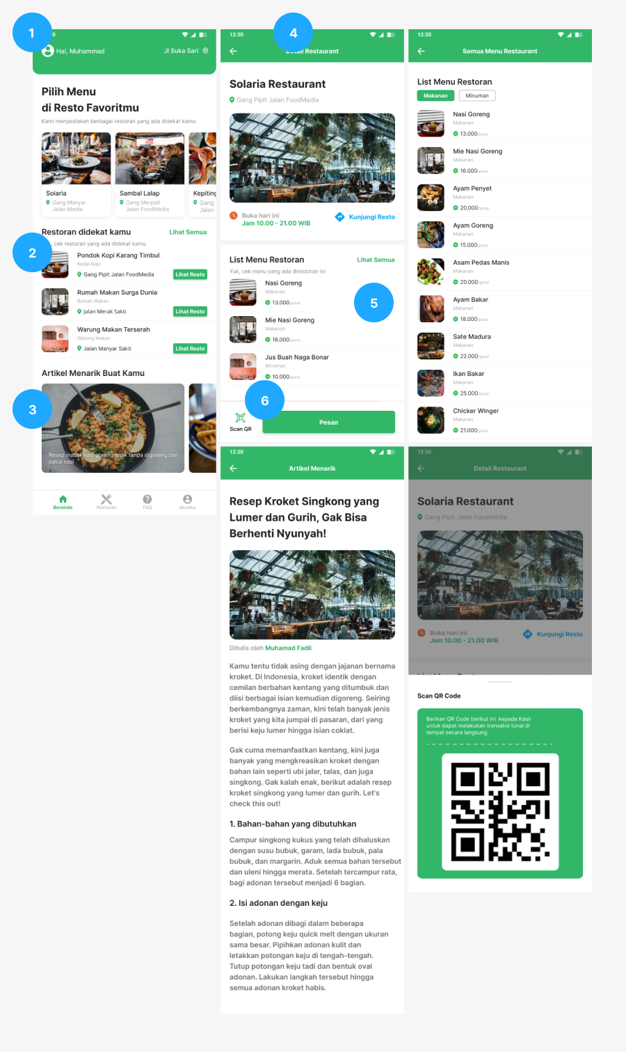
1.Card that displays the top 3 restaurants, which determines the admin dashboard
2.List items that display a list of restaurants closest to the user
3.Article cards to see recipes that you can cook yourself
4.Detail screen that displays restaurant name, image, address, opening and closing hours and can be visited via google map
5.Displays the restaurant menu list along with the price
6. Primary button for ordering and button for payment by qr code
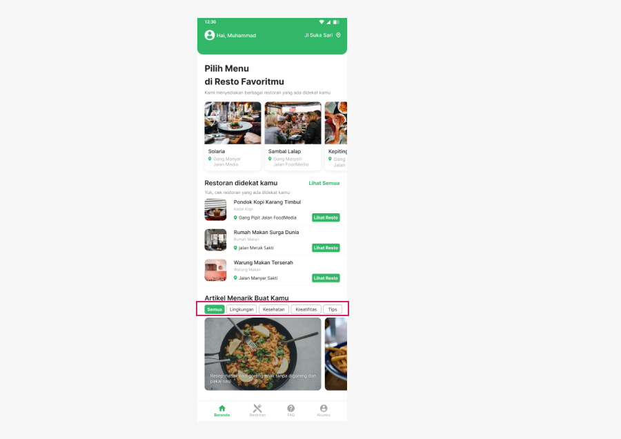
Next, I designed the display to display all restaurant lists and FAQ
.png)
Screen FAQ to answer user confusion questions when using the application
The account screen only displays user personal data and changes personal data via account screen
.png)
After I made all the screens, then I discussed the design that I made, whether it was appropriate or not with the project manager
After discussing it, I had to revise one slider button component because it was quite difficult to create in the database later and took a lot of time
After I revised my design and this is the final design I made so as not to complicate implementation later in the database
I am sure this design still has many shortcomings in terms of usability and I did not do any testing because it had to be pursued with the timeline, maybe then I can make a design that is even better in terms of functionality and aesthetics
